
A knight carved from cash.
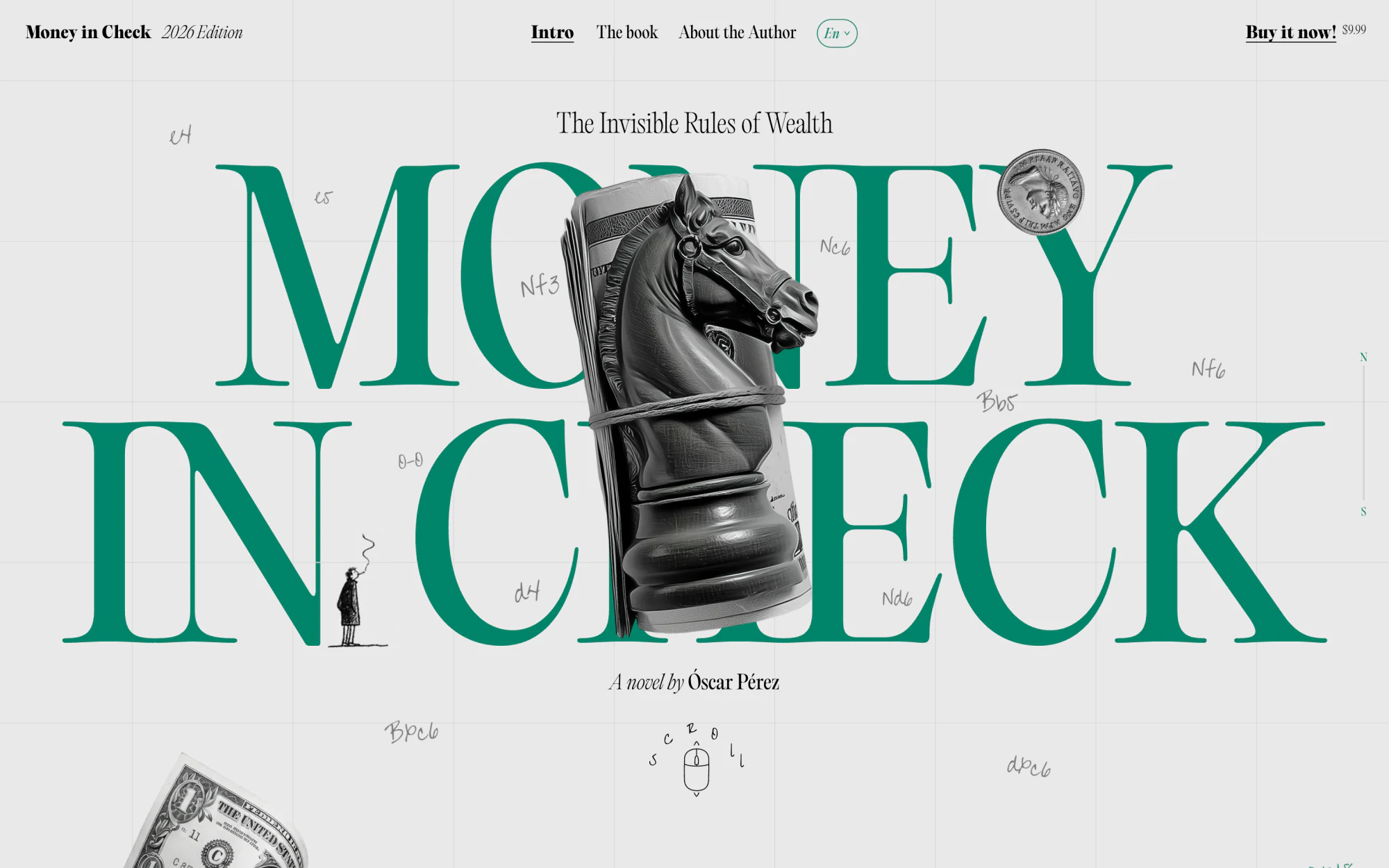
The opening frame plays it straight: a towering high-contrast serif, a chess knight sculpted from rolled banknotes, hand-drawn marginalia and a custom cursor. Editorial gravitas first — the wit reveals itself as you move.
Case study · Cloudstudio × Óscar Pérez
The launch site for a novel about the invisible rules of wealth — designed, like the book, as a game of chess.
( The commission )
Óscar Pérez wrote Money in Check — the story of Oliver Harper, a scholarship kid at Harvard who discovers that money is a game nobody taught him to play. The brief ruled out a bookshop page and anything that smelled of a finance site.
Instead, the site had to be the book's idea. So the whole page is a chessboard: a faint coordinate grid runs edge to edge, algebraic notation is scribbled through the margins like a game already in progress, and the pieces are sculpted out of banknotes. Nothing is decoration — every move on the page echoes a move in the book.
Money is a game. So we built the board.
( The game, move by move )
The opening frame plays it straight: a towering high-contrast serif, a chess knight sculpted from rolled banknotes, hand-drawn marginalia and a custom cursor. Editorial gravitas first — the wit reveals itself as you move.
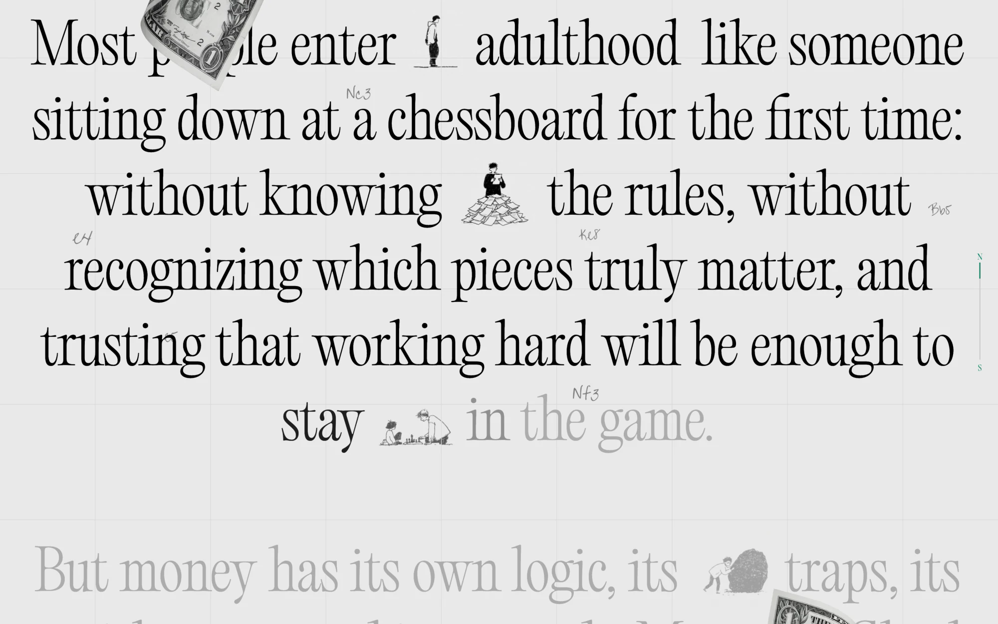
The book's argument builds word by word as you scroll — type turns from ghost outline to solid ink while illustrated characters wander through the columns. The reader earns each line, exactly like the book's premise: you only see the board once you know what to look for.
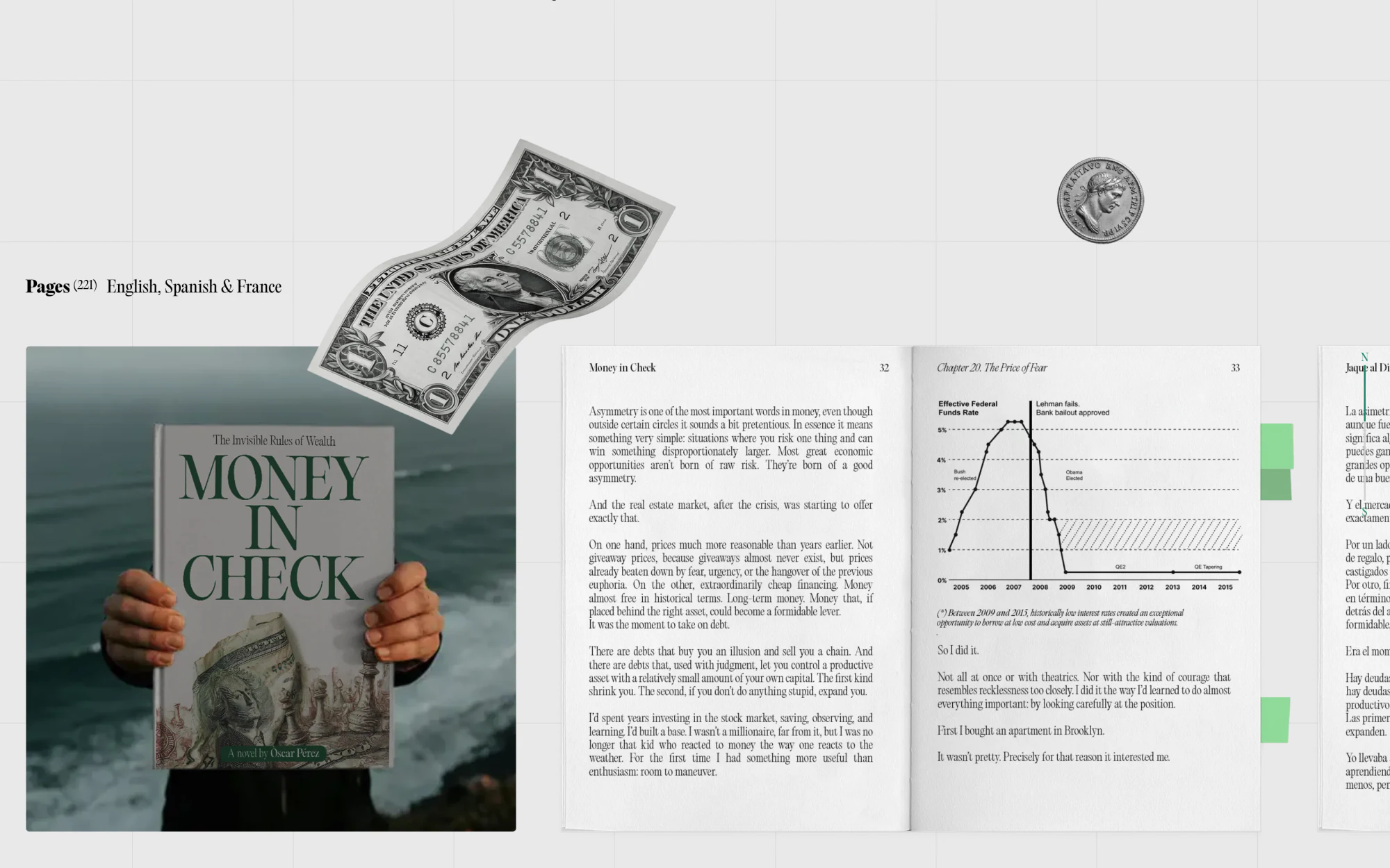
An honest preview: the cover in-hand, then a page-flip carousel through real interior spreads — chapters, charts, footnotes and all. Print, Kindle, audio and bundle pricing sit beside one-tap checkout and a launch email capture. The commerce is castled inside the story, not bolted on.
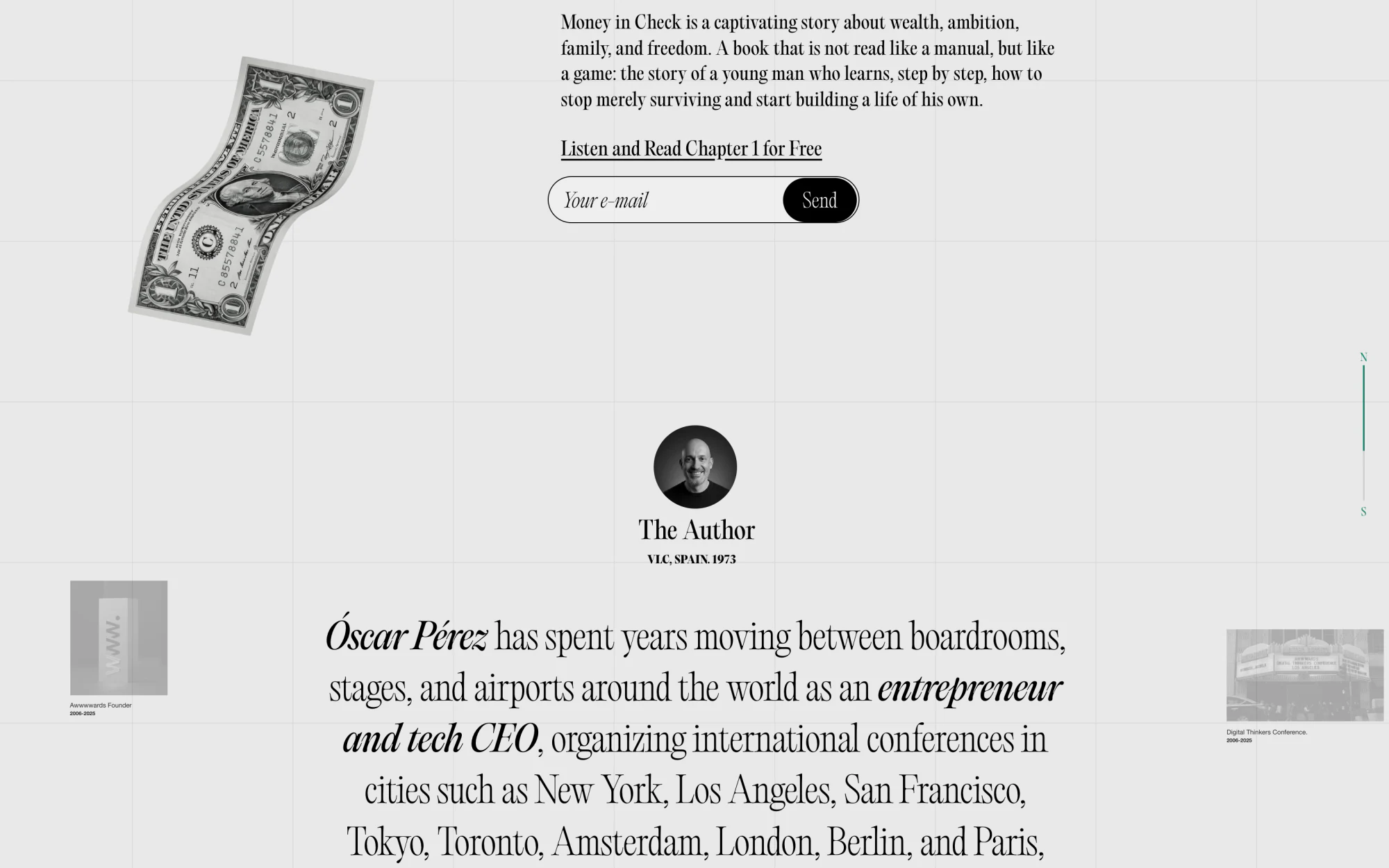
Óscar's two decades between boardrooms and stages — Awwwards, conferences from New York to Tokyo, work alongside Google, Microsoft and Adobe — set as an editorial spread with a timeline of career artefacts in the margins. Credibility as narrative, not a CV.
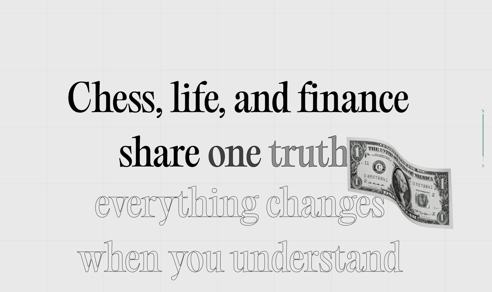
The site ends on the thesis, delivered in kinetic type over a cast of hand-drawn characters: chess, life and finance share one truth — everything changes when you understand the rules. The last frame leaves you holding the book's promise.
( Under the hood )
Scroll-driven typography, word-level reveals, parallax marginalia and a page-flip book — all tuned to stay smooth on a phone. Motion that serves the reading instead of interrupting it.
A coordinate grid, algebraic-notation marginalia, hand-drawn characters and a custom cursor form one coherent language — the book's metaphor encoded as a design system, in English and Spanish.
Interior-spread carousel, four-format pricing, one-tap checkout and launch email capture — native to the narrative, fast, accessible and SEO-ready from day one.
We design and build editorial experiences where motion and commerce are first-class citizens — like this one. Tell us what you're launching.